


Tuesday 4 April 2023: Traders' Handbook of Economic Cycles - Chapter 8: Time Counts and the Transient Nature of Cycles

Lifespan of Cycles
All cycles have a finite lifespan, meaning that they are born, they exist, and eventually they come to an end. Therefore, it is important to question the time span used to identify cycles in the stock market. It is a well-established scientific fact that there are no consistently profitable cycles in the market. Long-term cycles such as the Kitchin and Juglar cycles can be identified using mathematical procedures, but they are too lengthy for most traders traders.
Despite the absence of consistently profitable cycles, cycle analysis remains relevant in the financial markets. The lifespan of cycles should be accepted and accounted for in this analysis. For the application of this idea, the most important feature is the wavelet diagram. Below is an example of this diagram. It is for the Dow since 1992 (I had to cut the data a bit because producing the diagram is a bit computationally intensive)
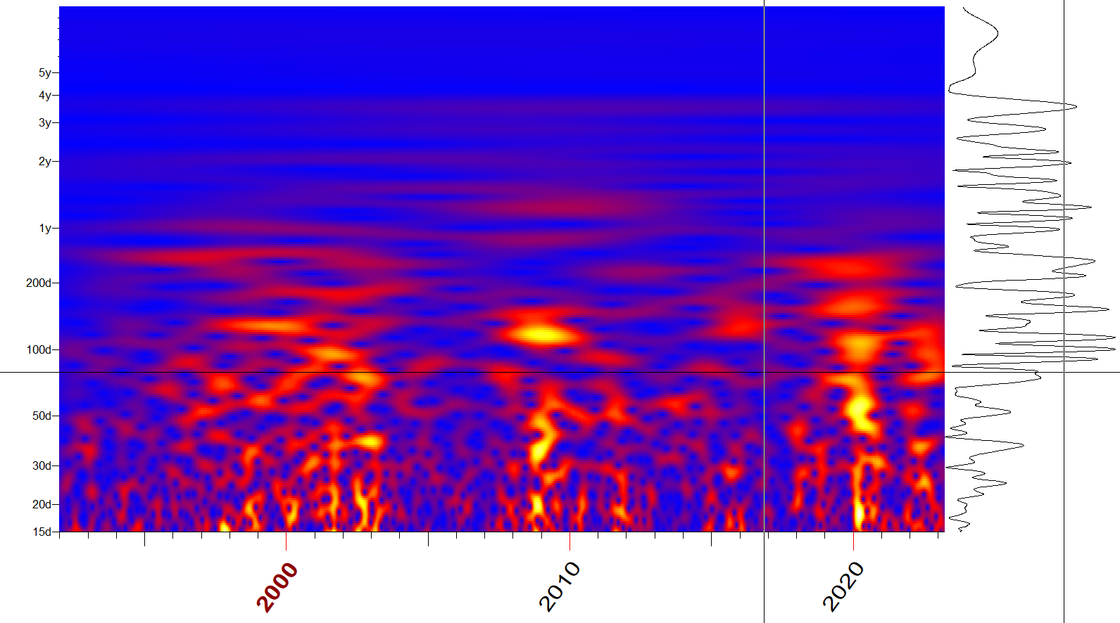
The wavelet diagram serves as a record of a cycle's life, displaying its biography in a clear and concise manner. This diagram presents the cycle's birthdate at X, its actions within Y, and its ultimate demise on Z.
The bio of the cycle is depicted by horizontal red and yellow stripes, representing its lifespan. On the diagram's horizontal axis, we see the progression of TIME, while the vertical axis displays the cycle's PERIOD. The hot zones, represented by red and yellow colours, illustrate active periods when the cycle is in motion.
Looking at the diagram, we can say that the Kitchin Cycle (period a little under 4 years) has been active pretty much throughout the 90s until now. It is the most consistent medium-term cycle as you see no interruptions in that dull red band. You can also see a consistent snaking red band around the 1 year mark, and there is a very unusual cycle/story there.
Short-term Cycles
In the shorted-end of the spectrum, you can see some cycles can become very intense/hot, but they come and go a lot. There could be a plethora of reasons for this. Notice how the intense zones seem to cluster around the major crisis periods…1998, 2000-2002, 2008 and 2020. Perhaps mass psychology progresses in very rhythmic waves during times of panic. The main periods of interest seem to consistently be:
34-40
50-55
74-82
87-93
100-120 days
Interestingly we see harmonic relationships between them i.e. simple mathematical relationships between the cycles.
Some of these cycles, and it is probably at most only two active cycles given the harmonics, have been heating up since late-2021. The ~80-day cycle is the most dominant and is illustrated below.

Notice the close alignments with lows in the market or the oscillator in the lower panel. If this cycle remains hot for one more recurrence, momentum peaks would likely be registered in mid- and late-April (11th to 25th). That would then be followed by an actual market peak some time in May prior to a consolidation or reversal leading to a low in early-June.
This is entirely consistent with our heatmap, which is constructed with completely different methods. It also helps us along with the concept of Time Counts to prepare for opportunities to take profits and or buy further dips if the thesis continues to hold.
Time Counts
The literature regarding counts is dominated by WD Gann. In essence it is believed that market extremes have a tendency to be separated by set periods which are defined as twelfths of a circle e.g. 30, 60, 90 days/weeks/months and so on. In my research, while trying to validate these counts, I have used statistical techniques to find if there are any tendencies at all as described by the likes of Gann. It turns out that there are periods around which the duration of campaigns HAVE HISTORICALLY clustered around.
Using recent market turning points, I project these counts into the future and then look for clusters of dates given the different initial starting points/conditions. I make no isolated assumptions regarding what those dates being tops or bottoms. I simply see them as potential times for a trend change or pause. I will pay more attention to clusters between these time counts and dates found using other techniques.
The following chart shows for 2023 the time-count dates in RED while those from other techniques are in GREY.

Now I hide the RED dates that are not clustering with other phenomena of interest prior to today’s date so that I can clean up the chart a bit.

These are the dates of interest in the immediate future:
7 April (given the holiday, this could be the 6th or the 10th)
14 - 20 April Cluster
27 April
2 - 4 May Cluster
15 - 22 May Cluster
Consider these in the context of the first half of our discussion.
Levels of interest
I will be keeping an eye on these dates especially if the market arrives with overbought/oversold conditions etcetera then. So lets see what levels may provide support in the interim:
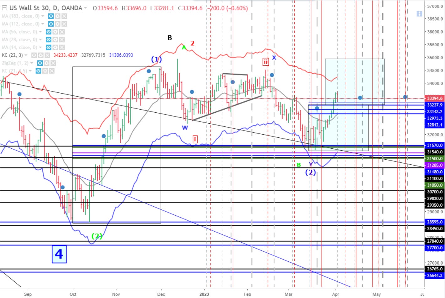
If the middle of that strong bar on the 31st of March proves to be the mid-point of a swing from mid-March, then a proportional move would target ~35,000. Could it be that the market will grind its way there into the 27 April - 4 May window? Let us keep track of this scenario, as the bullish case has strong legs if we remain above 32,800.
Recall that the ensemble forecasts generally suggest a move higher into early-May prior to a consolidation/correction of some sort.

And note that the market may be setting up for a period in the relatively lower-volatility “Buy the Dip” regime.
